Industry Logo Design
Aluminate
Project Overview
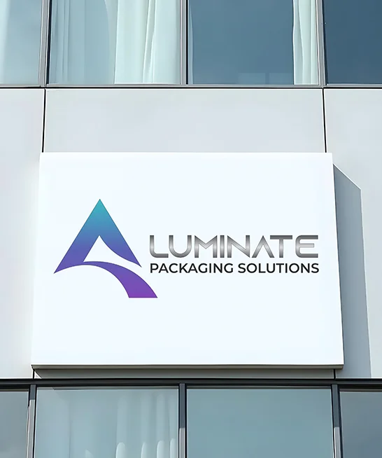
Aluminate Packaging Solutions is a manufacturer of high-quality packaging products, serving industries such as pharmaceuticals, cosmetics, and consumer goods. The company specializes in producing aluminum collapsible tubes, laminate tubes, and plastic cans designed to ensure product safety, durability, and efficient product dispensing.
As the company continues to grow and expand its presence in the packaging industry, it required a strong and modern brand identity that reflects its expertise, reliability, and forward-thinking approach.
Our team partnered with Aluminate Packaging Solutions to design a logo that communicates innovation, precision, and trust while maintaining a clean and professional visual identity suitable for both industrial and corporate branding.
Service
Logo Design, Brand Identity Development
Industry
Medical Spa, Skincare, Aesthetics
Logo Type
Combination Mark Logo
The Challenge
The primary challenge was to create a logo that balances industrial reliability with modern visual appeal. Since the company operates in the packaging manufacturing sector, the identity needed to convey strength, precision, and innovation while remaining simple and memorable.
The logo also needed to:
- Reflect the company’s focus on advanced packaging solutions
- Maintain strong visibility across packaging materials and digital platforms
- Be scalable and recognizable across multiple applications
- Establish a professional and trustworthy brand image
Design Strategy
Our approach focused on creating a minimal yet powerful visual identity built around the concept of innovation and growth.
We explored geometric forms and abstract structures that could subtly represent the brand name while also symbolizing strength, movement, and progress within the packaging industry.
The final concept integrates a stylized monogram symbol with modern typography, creating a balanced identity that feels both contemporary and industrial.
Logo Concept
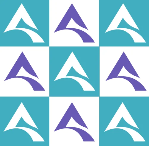
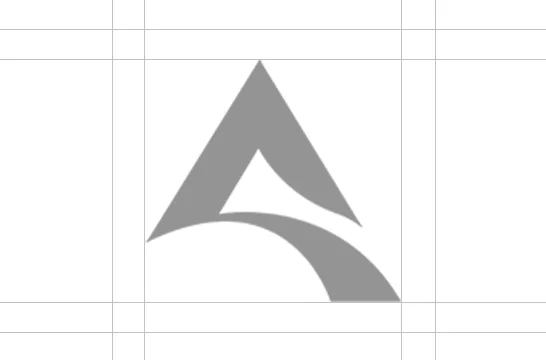
The symbol is built around an abstract geometric form inspired by the letter “A”, representing the initial of Aluminate. The triangular structure creates a strong and stable visual foundation, symbolizing reliability and engineering precision.
A curved element within the mark introduces a sense of flow and movement, representing innovation, flexibility, and the dynamic nature of modern packaging solutions.
Key symbolic elements include:
- Triangular structure: strength, stability, and manufacturing precision
- Upward form: growth, progress, and industry leadership
- Curved internal line: flexibility, innovation, and modern technology
This thoughtful combination creates a mark that is distinctive, scalable, and memorable.
Primary Color
Indigo Purple
HEX: #6759B4
RGB: 103, 89, 180
CMYK: 43%, 51%, 0%, 29%
HSL: 249°, 38%, 53%
Secondary Color
Muted Cyan
HEX: #67AFB8
RGB: 103, 175, 184
CMYK: 44%, 5%, 0%, 28%
HSL: 187°, 37%, 56%
Typo Color
Black
HEX: #000000
RGB: 0, 0, 0
CMYK: 0%, 24%, 88%, 8%
HSL: 44°, 83%, 51%
Final Result
The final logo successfully delivers a strong, modern, and versatile brand identity for Aluminate Packaging Solutions.
Key outcomes include:
- A distinctive symbol that represents the brand’s identity
- A professional and modern visual language
- A scalable design suitable for packaging, marketing, and digital platforms
- A future-ready brand identity that supports long-term business growth
The new identity positions Aluminate Packaging Solutions as a forward-thinking and reliable manufacturer in the packaging industry.
Call For More Info
+92 - 300 - 2278921
Let's Request a Schedule For Free Consultation
OUR SATISFIED CLIENTS
Some of the Wonderful Clients We've Worked with